Thursday, 14 November 2013

design


For this design I used Ian Keltie as inspiration. I started with the primary image of a friend the pose is intentional, as I wanted it to be bold funny and in your face because that what I feel comedy is about I put a note paper filter over the image and change the colour to a deep red. Using the brush tool I made circles of different sizes around the image and then smaller once I added a layer and changed the hue and saturation this changed the colours whilst still making them match with in the same colour palette. I changed the vibrancy to make the colours deeper and bolder.
     I then decided I want to model to stand out more and have a gradient. This is also I technique Keltie uses in his work. To do this I had to take the image out put it on a colour layer, chose the gradient merge visible and dragged back on to original document.
     I then added the time and place on to the poster to finish it off. Of all the design I feel this is the most successful because I feel the artists links to my work more the colours and lay out link well to the theme and convey comedy through the design.


design


To create this design I took inspiration from the Keep calm and carry on deign’ keeping the poster simple and minimalistic.
With one image/logo and text.
The style of the typography Is influenced by Neville Brody text varies horizontally and vertically also typography within other words. The title, genre and date and location of the production is the only text on this piece I didn’t want to put irrelevant text on.
            I started with a bold, deep red background, which symbolises excitement, energy but also aggression and violence I carried on with the design with the red background adding the text with the image but didn’t feel like it was the right colour for my design I decided to use yellow which was more appropriate as it signifies joy, happiness, sunshine, summer and imagination. Not only this, the design benefited from the change of colour it conveys the theme comedy more with it being an uplifting colour.
            The image is the person who I am using as my performer. I took the picture while we were in the Northern Quarters. The model is pulling a face where his teeth stick out looking goofy linking to the humorous genre of comedy. I feel that the piece is successful I have put though in to each decision I have made trying to represent comedy I find this hard to convey humour and emotion through graphics. I made finaly changes to the filter of the image and the colour of both image and text. This the deign stronger because the image was clearer and the bold black text wasn’t the most eye catching part of the design.

design 2


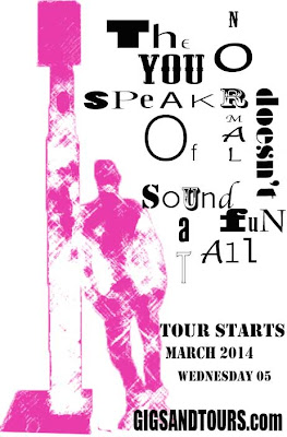
This was a short process for the design I scanned in the mono print I did of a primary image and changed the brightness and contrast I also enhanced the image with the exposure. I thought the design would be more affective if the image had colour which wasn’t bright and bold like the rest of the design ideas, I wanted to capture and convey the urban style of the comedian I was creating I feel this design does exactly that with the typography like a stencil the is a lot of negative space with I also feel is affective I feel this is once of my stronger designs but doesn’t convey the theme of comedy which is the purpose and meaning of the design.

mono print design


I started this design with a mono print of a primary image that was taken at the Northern Quarters. Originally the mono was blue the changed the colour and contrast of the print and deleted the background. I chose to do a mono print because I used the process before and was really happy with the outcome.
        The next step was putting a background behind the print. This was an image of a brick wall which had graffiti on, my reason for this was to convey the urban style through imagery. After I experimented with the images flipping them and changing the filter I still wasn’t happy with the direction the design was going in so I took a different approach.
     The idea was to try and make the back ground not as bold and faded out to draw all the attention to the model but after trying more experiments I was still not satisfied.
     I decided to start from scratch again which was helpful
.because instead for trying to change what I had I came up with a new idea after looking in a few graphic design books for inspiration. I opened the mono print again and changed the filter to fill the area of the model with a bold attractive colour then keeping bold in mind I wanted the typography to be engaging and interesting for the viewer to attract attention so I took inspiration from Neville Brody I used different fonts at various sizes. I’m really happy with them out come I feel it is a strong design creating a positive mood.

mono print of a primary image


mono print design


This was not the original design I could not find a style I liked I spent the most time on this design trying different filter and typography. I wanted the style to look like It was a black and white television screen I could of gone further to put the border as a television but I didn’t want any of what was already on the page to be squashed in to a small space. My idea was for the typography to stand out and attract attention other than the picture.
 

mono print design

Firstly I created a mono print of Jake Bugg a performer I chose him because mono print reflects the indie style he has within his music and his appearance. I chose to keep the typography simply and minimalistic. What I like most about this piece is the detail and shading. The nose is not straight but I feel the line and tone is affective. I wouldn’t change any of the typography but I will be more careful with facial features when mono printing