I
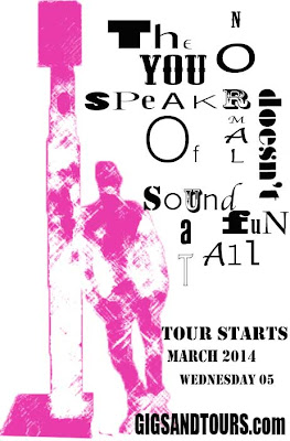
started this design with a mono print of a primary image that was taken at the
Northern Quarters. Originally the mono was blue the changed the colour and
contrast of the print and deleted the background. I chose to do a mono print
because I used the process before and was really happy with the outcome.
The next step was putting a background behind
the print. This was an image of a brick wall which had graffiti on, my reason
for this was to convey the urban style through imagery. After I experimented
with the images flipping them and changing the filter I still wasn’t happy with
the direction the design was going in so I took a different approach.
The idea was to try and make the back ground
not as bold and faded out to draw all the attention to the model but after
trying more experiments I was still not satisfied.
I decided to start from scratch again which was
helpful
.because instead for trying to change what I
had I came up with a new idea after looking in a few graphic design books for
inspiration. I opened the mono print again and changed the filter to fill the area
of the model with a bold attractive colour then keeping bold in mind I wanted
the typography to be engaging and interesting for the viewer to attract
attention so I took inspiration from Neville Brody I used different fonts at
various sizes. I’m really happy with them out come I feel it is a strong design
creating a positive mood.

No comments:
Post a Comment